
Wednesday, March 14, 2012
Design Idea: Tapestries
I'll admit, when I think of tapestries, I think of stuffy old homes with stale decor. However, I have been seeing a lot of really fresh and modern tapestries, such as this one from Urban Outfitters. Large prints can really amp up a dull space. For $39, you can transform that glaring blank wall in your apartment into a colorful focal point. These are perfect for rentals, since most people don't want to deal with the hassle of repainting when it's time to move. Currently, I have two large beach prints hanging on my walls--courtesy of my friends at Quiksilver!

Tuesday, March 6, 2012
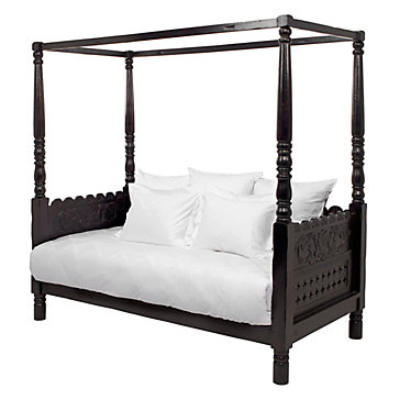
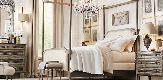
Design Spotlight: Four Poster Bed.
Maybe I get distracted too easily, but I couldn't help but get distracted in this post on Apartment Therapy. The post is actually about doing your research when purchasing a new camera, but my eyes are glued to the beautifully-lit four poster bed:

I honestly couldn't even tell you camera-buying tips from this post, because as soon as I saw that bed I immediately scoured Google Images for four-poster beds. I decided to trade in my childhood fantasy of having a canopy bed with the more modern fantasy of stringing lights over the posts, just like the bed in the photo above. Check out a few of my favorites below:

I honestly couldn't even tell you camera-buying tips from this post, because as soon as I saw that bed I immediately scoured Google Images for four-poster beds. I decided to trade in my childhood fantasy of having a canopy bed with the more modern fantasy of stringing lights over the posts, just like the bed in the photo above. Check out a few of my favorites below:
Friday, March 2, 2012
Cigar Room at Le Maison, Champs Elysees
I love this cigar room at Le Maison Champs Elysees in Paris. The exposed lighting really stands out against the chalkboard-colored walls. I don't smoke cigars, but I would consider taking up the habit if I ever get a chance to visit this gorgeous hotel in person!

Tuesday, February 28, 2012
Cinequest Premiere of 'Worth The Weight'
I recently had the pleasure of interviewing Ryan Sage, the director of Worth The Weight--a heartfelt, independent romantic comedy about a former athlete whose struggle to lose weight parallels his quest for love. The film will debut this Friday, March 2 at Bay Area film festival, Cinequest. If you will be in San Jose this weekend, I definitely recommend seeing the film.
Worth The Weight is a romantic comedy that Sage bought off Craigslist for $500. On the film's official website (www.worththeweight.com) you can see the original ad he posted that asked for the script. Sage got many responses, including one that referred to him as a "jackass" for thinking he would be able to buy a finished script for a mere $500. Another interesting thing about this film? Sage and the writer he bought the script from have never met! They communicated changes and revisions to the script via email and telephone. Sage and Dale Zawada, the writer, will actually meet for the first time at the premiere of Worth The Weight at Cinequest.
You can read the feature I wrote here, and check out TYTE Media to read more about the making of Worth The Weight--including a feature on the film's writer, Dale Zawada.
Thursday, February 23, 2012
Minted
I usually tend to shy away from pastels, but lately I have been obsessed with mint-green. I took a break from my usual bright nail colors and opted for a mint-green polish from Urban Outfitters. I was really inspired by the color, so I also made a mint-green set on Polyvore:


Rodarte: S/S 2012
NYFW may be behind us, but my love of Rodarte continues. I love this photo collection by Nicolas Henderson:


Tuesday, February 21, 2012
Sofia Coppola's Video for H&M and Marni
While we await the much-anticipated Marni for H&M line to hit stores on March 8, H&M released this promo vid directed by one of my favorite filmmakers, Sofia Coppola. The classic, bold prints from the collection pair beautifully with Coppola's signature soft lighting. The micro-movie was shot in Morocco, and leaves you in a dreamy state-of-mind. Check it out:
Wednesday, February 15, 2012
CB2: Acrylics, Grays, and Splashes of Color
On a recent trip to CB2 (Crate and Barrel's edgier, more modern sibling) I found some interesting trends in home decor. My favorite trend was the eye-catching neon acrylic accents CB2 had scattered around the store. Acrylic is not exactly a cozy material and can appear cheap if it's overused. Also, neon accents are very trendy in interior design right now, but I think these neon acrylic frames would add the perfect dash of color to any space:

Vase of neon acrylic flowers.

Multicolored-striped armchair.

Black, white and a splash of red. Love the 'Relax' headboard!

Monday, February 13, 2012
Around L.A.: LACMA
As a resident of Southern California since birth, I'm a little embarrassed to admit that two weeks ago was my first visit to LACMA (Los Angeles County Museum of Art, I know that, thank you very much!) I was pleasantly surprised to discover that LACMA offers free admission to L.A. residents after 5p.m. on weekdays. Looks like I just found an excuse to go more often.

Words can never describe how much I want this huge balloon animal:


Tuesday, February 7, 2012
Spring/Summer 2012 Ad Campaigns
I love this video. Alice Dellal is one of my favorite models because she always manages to look badass, yet still emulate high fashion. I was so excited to see her work her magic for Chanel's Spring-Summer 2012 collection, check it out:
Lanvin's Spring-Summer 2012 ad was also one of my favorites. I love the upbeat music and the use of stop motion. The snakes and jeweled masks make me feel like I stumbled into a secret soiree:
Lanvin's Spring-Summer 2012 ad was also one of my favorites. I love the upbeat music and the use of stop motion. The snakes and jeweled masks make me feel like I stumbled into a secret soiree:
And although a little strange, a couple of honorable mentions go to Alexander Wang for featuring Die Antwoord in his campaign, and to Missoni for featuring Pedro Almodovar! It's always nice to see artists from different mediums collaborating, even if the result leaves you scratching your head.
Monday, February 6, 2012
Around L.A.: Some Super Bowl Sunday Sunshine
View from my apartment on Super Bowl Sunday. Yes, that blur on the hills is the Hollywood sign! Turns out iPhones don't make the best cameras.

Friday, February 3, 2012
I've Been Featured! Street Style On 'Just Jasmine'
Check me out! I was featured on Just Jasmine's blog, which has great styling tips and fashion advice. Here's a sneak peak, but check out the rest of the post (and my outfit) on her awesome site!

Shameless Food Post: Bricks and Scones
I'm not one to normally post photos of my food, but seriously, how awesome is this latte art?! Creation courtesy of Bricks and Scones in L.A.'s Larchmont Village:


Wednesday, February 1, 2012
Taste Test: Starbucks Blonde Roast, Veranda Blend
Before I go into my review, you should know that while I love coffee, I have always preferred lighter, more mellow blends. I also happen to not be on the "Charbucks"-hating bandwagon, I truly believe the company makes a good cup of coffee! According to Starbucks' market research, both of these characteristics make me predisposed to like the new Blonde roasts.
Anyways, on to my review. After much deliberation between the Willow and Veranda blends, I decided on Veranda, which is described as a mellow blend with hints of nuts and cocoa. For the sake of comparison, the Willow blend is meant to have a bright, clean, and citrusy finish. Final verdict? The Blonde Veranda roast is just ok, and to be honest, it's a little bland. It's as if an important flavor note is missing from the blend. There is also a strange aftertaste that follows each sip, an aftertaste that can only be described as 'coffee water'. As mentioned above, this is coming from a coffee drinker that prefers lighter blends. Unfortunately in this case, I think the roasters mixed up 'lighter' with 'flavorless'. If I think it's too bland, I would definitely not recommend the Blonde roasts to someone who enjoys a more full-bodied coffee. Looks like I will be sticking to the Breakfast blend!

Monday, January 30, 2012
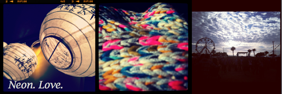
Neon Decor
As the weather gets warmer (in L.A., anyway!) design inevitably gets brighter. I loved these photos from Apartment Therapy's recent feature on the return of neon in interior design. Here are a couple of my favorite rooms from the feature:


Sunday, January 15, 2012
Kate Spade Dubs 2012 'The Year of Pattern'
Last year, Kate Spade introduced new items in their collection through a monthly feature called color of the month. From January through December, Kate Spade amped up 2011 with hues that ranged from deep cobalt to sunny yellow. This year, Kate Spade shook things up by announcing that they will feature a pattern each month. The first pattern of 2012 is stripes, a pattern I truly adore. Check out this set I made on Polyvore (my first one!). It contains some some of my favorite striped items-including a bag featured in Step Out in Stripes!


Wednesday, January 11, 2012
Shut Up and Play The Hits
"When you start a band, do you imagine how it will end?"
James Murphy, the frontman behind the non-stop dance party that was LCD Soundsystem, is asked this question in the upcoming film, Shut Up and Play the Hits. The film features LCD Soundsystem's farewell show that took place April 2, 2011 in Madison Square Garden, and follows James Murphy in the final moments of his band's existence. I'm beyond excited for the release of this film, mainly because like so many others, I didn't get the chance to see their farewell show. Judging from the trailer, it looks like the filmmakers did an amazing job capturing the band's epic farewell show:
James Murphy, the frontman behind the non-stop dance party that was LCD Soundsystem, is asked this question in the upcoming film, Shut Up and Play the Hits. The film features LCD Soundsystem's farewell show that took place April 2, 2011 in Madison Square Garden, and follows James Murphy in the final moments of his band's existence. I'm beyond excited for the release of this film, mainly because like so many others, I didn't get the chance to see their farewell show. Judging from the trailer, it looks like the filmmakers did an amazing job capturing the band's epic farewell show:
Tuesday, January 10, 2012

Monday, January 9, 2012
It's Here! Coachella 2012 Lineup

Seriously amazing lineup this year-now I only have to decide which weekend I want to go!
Friday, January 6, 2012
Wish List: Black Poppy Neon Nail Strips
My nails are always painted-usually a different color every week. In an effort to shake things up a bit, I have been wanting to try nail strips, but I just haven't seen a design that has caught my eye. That may change now that PacSun's Black Poppy brand introduced these neon nail strips. Being a teenage-centric brand, there are lame designs (ahem, glittery hearts?!) and then there is THIS, a gorgeously-blinding neon yellow. You can read more about PacSun's Black Poppy Nail Polish here. It may be January, but summer, I've got my eye on you.


Monday, January 2, 2012
Lighten Up!
We all get the winter blues, especially my sunny-SoCal-beach-loving self. Tess Wilson, a San Francisco contributor for Apartment Therapy, paired a mirrored garland with white mini lights in an effort to beat SF's winter blues. Despite the 80-degree L.A. weather, my apartment doesn't get a lot of light and can seem really gloomy, so to cheer up the space I use a combination of multicolored lights and white paper lanterns. However, I love this lighted garland so much I may have to make one of my own! Lucky for me, Tess explains how to make one here.
 |
| Image via Tess Wilson of Apartment Therapy |

Subscribe to:
Posts (Atom)